PORTFOLIO
Logo
Concept
Loog concept
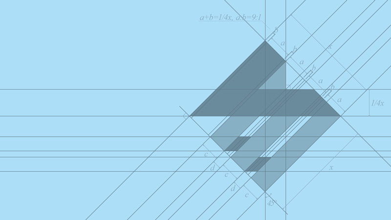
Logo sketch
Logotype
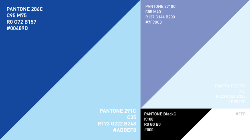
Primary color
Supporting graphics
Primary usagen
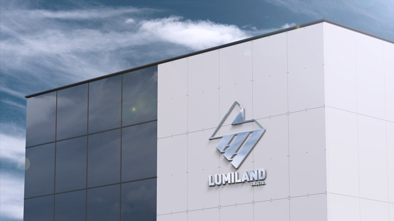
Logo
Logo
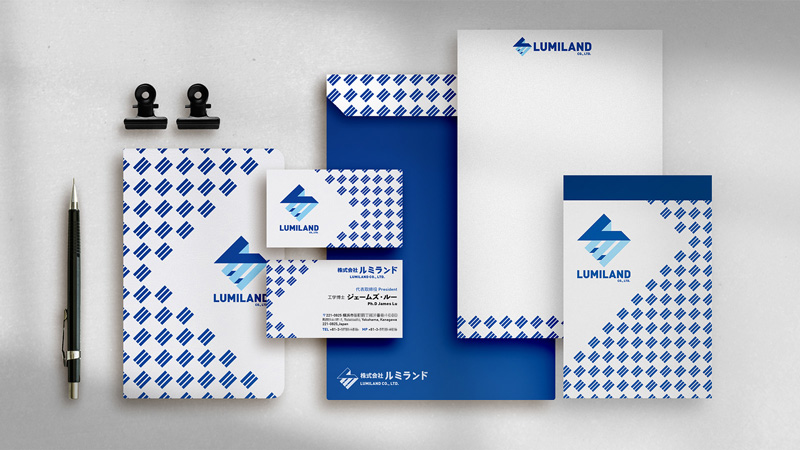
Stationery

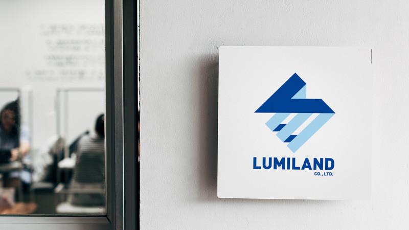
Logo
Logo
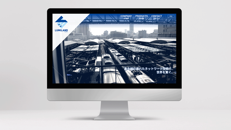
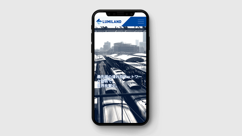
Web design
Web design
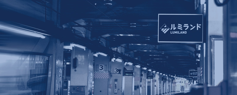
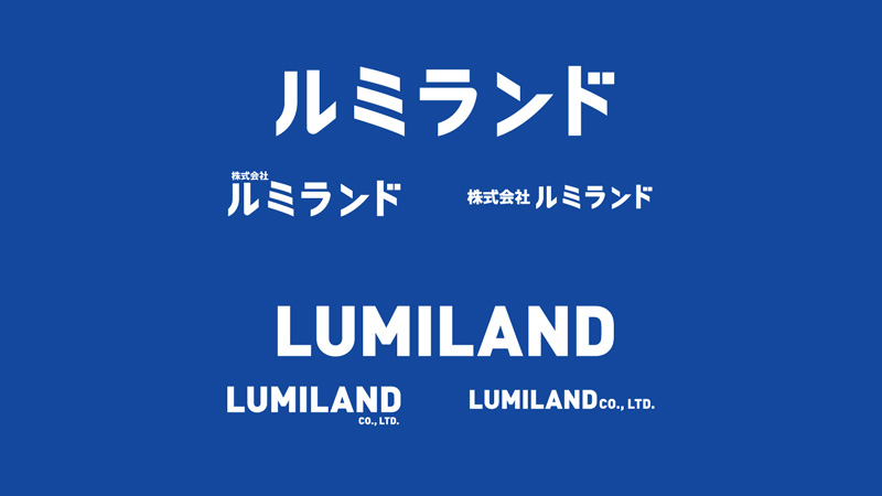
ルミランド
LUMILAND
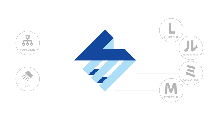
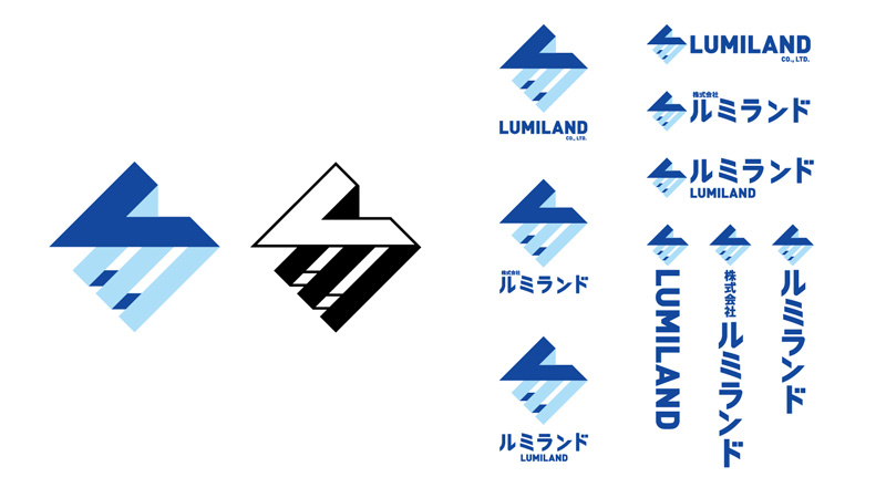
以ルミランド的「ル、ミ」衍生出正方體造型,形成穩重與科技兼具的存在感;線條連接轉折出「L、M」的英文字母縮寫,也象徵著用整合與串連來連接世界上所有系統與通訊的概念,下方線條也如同光芒的照射,呼應公司名稱的由來——ルミランド,發光的地方。
The cube shape is derived from the "ル、ミ" of ルミランド, forming a sense of presence with both stability and technology; the letter of "L, M" is formed by the connection of lines, which also symbolizes the use of integration and series to connect all in the world. The concept is system and communication, the line below is also like the radiance of light, echoing the origin of the company name - ルミランド, the place where light shines.